
Optimizing Tap Targets: Enhancing Mobile UX and Accessibility
Optimizing tap targets and font sizes is crucial for superior mobile UX design and accessibility. This guide details best practices for creating clickable elements that meet WCAG 2.1 standards, ensuring users can easily interact with web content. Proper sizing of interactive areas prevents misclicks, reduces user frustration, and enhances font legibility, directly impacting patient experience and conversion rates. Implementing these guidelines improves site usability for all users, particularly on medical websites where clear navigation and optimizing tap targets are paramount for a smooth patient journey and improved conversions.
Abdurrahman Şimşek, a Semantic SEO Strategist, provides expert guidance on technical SEO and mobile-first design. This content leverages his expertise to help businesses improve their digital presence and user engagement through accessible web practices.
To explore your options, contact us to schedule your consultation. You can also reach us via: Book a Semantic SEO Audit, Direct WhatsApp Strategy Line: +90 506 206 86 86
This guide covers optimizing tap targets and font sizes, two mobile UX design elements that impact accessibility, user satisfaction, SEO performance, and conversion rates. It details best practices and technical implementation for medical clinics, particularly in competitive markets like London, to improve the patient journey.
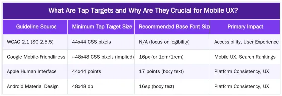
What Are Tap Targets and Why Are They Crucial for Mobile UX?
Tap targets are the interactive areas on a mobile screen for links, buttons, or other controls. Their size and spacing are fundamental to mobile user experience (UX) and web accessibility (a11y). Proper sizing prevents misclicks and user frustration.
Adequately sized interactive elements are a necessity for users on smaller screens or with varying motor skills. If touch targets are too small or close together, users struggle to access information or complete actions.
Understanding the Impact on Patient Experience
On medical websites, poorly sized interactive elements are particularly harmful. Patients seeking urgent information, appointments, or health resources may abandon the site if they struggle to tap a “Book Consultation” button or navigate a menu. Effortless interaction is key to a smooth patient journey and reinforces the clinic’s professionalism and care.
WCAG & Google Guidelines: Recommended Tap Target and Font Sizes
Web Content Accessibility Guidelines (WCAG) 2.1, Success Criterion 2.5.5 Target Size, recommends a minimum target size of 44 by 44 CSS pixels for interactive elements. This standard accommodates users with various dexterity levels and those using devices in diverse conditions or with assistive technologies.
Google’s mobile-friendliness guidelines recommend large interactive elements that do not overlap. For font sizes, while WCAG does not specify a pixel value, a base of 16px (or 1em/1rem) is a recommended starting point for mobile body text. Line height (typically 1.5 times the font size) and sufficient color contrast are also important for legibility.
Decoding Google’s Mobile-First Indexing Requirements
Under mobile-first indexing, Google primarily uses a site’s mobile version for ranking. The size and spacing of interactive elements and text legibility are critical evaluation factors. These elements contribute to Core Web Vitals metrics like Cumulative Layout Shift (CLS) and First Input Delay (FID), which are significant ranking signals. Sites with poor mobile usability risk lower search rankings. Responsive design that adapts these elements is essential for visibility. Learn more in our guide on Mobile-First Indexing: Designing Responsive Websites for Patient Journeys.
How to Implement Optimal Tap Targets and Font Sizes in Web Design?
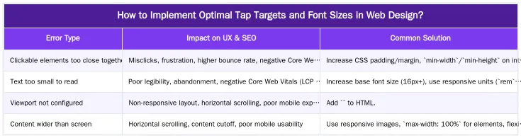
Implement optimal touch targets and font sizes with CSS. The goal is to make elements easily tappable without increasing their visual size. For buttons and links, applying sufficient CSS padding is a straightforward method. For instance, adding `padding: 12px;` or more expands the interactive zone of a visually small button.
The `min-width` and `min-height` properties can enforce minimum dimensions to meet accessibility standards. For text, use responsive font units like `rem` (root em) and `em` (relative to parent) instead of fixed `px` values. These units scale with user browser settings or viewport size for legibility across devices. The `vw` (viewport width) unit is effective for scaling headings. Legible font families, like sans-serif options, also enhance readability on mobile screens.
CSS Techniques for Enhanced Clickable Areas
Advanced CSS can also refine interactive areas. For icons or small text links, pseudo-elements like `::before` or `::after` with a larger `width`, `height`, and `position: absolute;` can create an invisible, expanded touch target. This maintains a minimalist aesthetic while providing a large interactive zone. Another method is to wrap small elements in a larger parent container and apply the `onclick` event or `href` to the parent, making the container the touch target. Consistent application of these techniques creates a cohesive, accessible mobile experience.
Fixing ‘Clickable Elements Too Close Together’: A Technical SEO Perspective
The Google Search Console error “Clickable elements too close together” is a mobile usability issue impacting technical SEO. It means interactive elements are too close, causing users to misclick. These issues frustrate users, increase bounce rates, and negatively affect Core Web Vitals like First Input Delay (FID) and Cumulative Layout Shift (CLS).
Resolving this error improves search rankings. Audit your mobile layout, identify pages flagged by Google Search Console, and apply CSS adjustments like increased padding or margins. Fixing these issues enhances user satisfaction and signals mobile usability to Google. This improves crawl budget efficiency, as Googlebot can better index an accessible mobile interface.
Reducing Cost of Retrieval with Improved Mobile UX
An accessible mobile interface reduces Google’s “Cost of Retrieval” (CoR), the computational resources used to crawl, render, and understand content. Mobile usability issues like small or overlapping elements make it harder for Googlebot to parse a page’s layout and links. This increases CoR, which can slow indexing or reduce crawl rate. Improving mobile UX with proper element sizing and spacing lowers CoR and improves indexing efficiency. Learn more in our article on Reducing Cost of Retrieval: Technical SEO for Efficient Medical Website Performance.
Enhancing Patient Experience & Conversions Through Mobile Accessibility
Optimizing interactive elements and font sizes on a medical website impacts patient experience and conversion rates. For plastic surgeons and aesthetic clinics, a usable mobile site demonstrates patient care and accessibility, key components of E-E-A-T (Experience, Expertise, Authoritativeness, Trustworthiness). When patients can easily navigate, read information, and tap calls-to-action (CTAs) like “Book a Consultation” or “View Gallery,” their trust grows. This reduces friction in the patient journey, increasing conversions.
Accessible CTAs are vital. If a patient struggles to tap a link to learn more or book a consultation, the engagement opportunity is lost. Properly sized and spaced elements create a positive user flow, guiding patients to their goals. This improves conversions and enhances the clinic’s perceived professionalism and reliability.
Building Trust and Authority in YMYL Niches
In Your Money Your Life (YMYL) niches like private healthcare, strong E-E-A-T signals are paramount. A difficult mobile site undermines trust, regardless of content quality. An accessible mobile site reinforces E-E-A-T by showing the clinic values patient experience and has a professional digital presence. This detail signals expertise and authoritativeness, building patient trust. This is essential for building patient relationships and competing in markets like London’s private healthcare sector. For strategies, see our Medical SEO Services for Surgeons: A Data-Driven E-E-A-T Framework.
Ready to Optimize Your Medical Website’s Mobile Experience?
Optimizing tap targets and font sizes is critical for medical websites, especially in competitive markets like London’s private healthcare sector. These mobile UX elements influence accessibility, patient satisfaction, SEO performance, and conversion rates. Adhering to WCAG and Google guidelines, using proper CSS, and fixing mobile usability errors enhances your digital presence and builds patient trust.
If your medical website struggles with mobile usability or you aim to attract high-value patients through local organic search, we can help. Book a Semantic SEO Audit to transform your mobile experience. You can also reach us directly via our Direct WhatsApp Strategy Line: +90 506 206 86 86.
Frequently Asked Questions
What is the minimum recommended size when optimizing tap targets on a medical website?
According to Google’s guidelines and WCAG 2.1, tap targets should be at least 44 by 44 CSS pixels. This standard is crucial for optimizing tap targets to ensure users, including those with motor impairments, can accurately tap buttons and links without frustration, enhancing overall mobile accessibility.
How can I make tap targets larger without changing the visual design?
The most effective
Ruxi Data brings together multi-model AI, automated website crawling, live indexation checks, topical authority mapping, E-E-A-T enrichment, schema generation, and full pipeline automation — from crawl to WordPress publish to social posting — all in one platform built for agencies and freelancers who run on results.