
Responsive Vs Adaptive Design: Optimizing Medical Sites for Patient Experience and SEO
This article clarifies the fundamental differences between responsive vs adaptive design for medical websites, focusing on their impact on patient experience and search engine optimization. Responsive design utilizes a single, fluid layout adapting to any screen size via CSS media queries and fluid grids, making it Google’s preferred method for mobile-first indexing and simplified maintenance. Conversely, adaptive design employs multiple fixed layouts for specific device breakpoints, offering precise control but increasing development complexity. Understanding these approaches is crucial for medical sites aiming to enhance mobile web development, improve healthcare UX, and achieve robust mobile SEO.
Abdurrahman Şimşek, a Semantic SEO Strategist, provides insights into how these design choices align with E-E-A-T principles and influence a medical site’s long-term digital performance. Strategic design decisions are vital for attracting high-value patients and ensuring optimal online visibility.
To explore your options, contact us to schedule your consultation. You can also reach us via: Book a Semantic SEO Audit, Direct WhatsApp Strategy Line: +90 506 206 86 86
Web design choice impacts patient experience and search visibility for medical sites. This article compares responsive vs adaptive design mechanics, benefits, and drawbacks for healthcare websites in 2026, informing London’s private clinics and plastic surgeons on attracting high-value patients.
Responsive vs. Adaptive Design: What’s the Core Difference for Medical Sites?
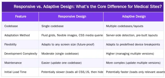
Responsive design uses a single, fluid layout that adjusts to any screen size, making it Google’s recommended approach for mobile-friendliness and SEO. Adaptive design employs multiple fixed layouts for specific device breakpoints, offering more control but increasing development and maintenance complexity. For medical websites, responsive design offers SEO benefits like simplified indexing and better mobile-first performance, and is more cost-effective long-term.
Understanding Responsive Web Design: Fluidity for Every Device
Responsive web design uses a single codebase, fluid grids, flexible images, and CSS media queries to adjust the layout, content, and imagery to fit any user’s screen. A responsive website functions optimally on desktops, tablets, and smartphones without separate versions.
Understanding Adaptive Web Design: Tailored Experiences for Fixed Breakpoints
Adaptive web design creates multiple fixed layouts for predetermined screen sizes. The server detects a user’s device or screen size (often via user-agent sniffing) and serves the most appropriate pre-built layout. This method offers precise control for known device breakpoints but requires more planning and management.
Technical Mechanics: How Each Design Approach Adapts Content
The difference between responsive and adaptive design is their technical implementation and content adaptation method, a key factor in front-end development for medical platforms.
Responsive Design in Action: CSS Media Queries and Fluid Grids
Responsive design uses client-side technologies. It uses relative units (like percentages or `em` units) for layout elements to scale proportionally. Images are flexible, adjusting their size based on the viewport. Its core is CSS media queries, which apply different styles based on device characteristics like screen width, height, orientation, or resolution. For instance, a media query can collapse a three-column desktop layout into a single column on a smartphone for readability.
Adaptive Design’s Fixed Layouts and Server-Side Detection
Adaptive design uses server-side detection. The server identifies the device type or screen dimensions from the browser request and delivers a pre-rendered HTML and CSS file for that breakpoint. This results in several distinct website versions. While this can offer optimized experiences for specific devices, managing each version becomes complex as new device breakpoints emerge.
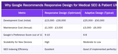
Why Google Recommends Responsive Design for Medical SEO & Patient UX?
For medical websites, Google’s recommendation for responsive design is significant because it impacts mobile SEO, patient user experience, and site performance.
SEO Advantages: Mobile-First Indexing and Simplified Site Management
Google recommends responsive web design because it uses a single URL and HTML codebase for all devices. This simplifies crawling and indexing, reducing the “Cost of Retrieval” for efficient ranking. With mobile-first indexing, Google primarily uses the mobile version for ranking. A responsive site ensures the same content is optimized across all devices, preventing duplicate content or fragmented link equity issues common with separate mobile sites.
Enhancing Patient Experience, Accessibility, and Trust in Healthcare UX
A consistent user experience (UX) across devices is important for medical sites where patients access information, book appointments, or use patient portal design features. Responsive design ensures forms are easy to fill, text is legible, and navigation is intuitive. This consistency builds trust and reduces frustration. Responsive design also supports accessibility standards, making the site usable for a wider audience, including those with disabilities. This experience signals professionalism and reinforces the expertise, authoritativeness, and trustworthiness (E-E-A-T) of your medical practice.
Strategic Design for Medical Sites: Aligning with E-E-A-T and Semantic SEO
For medical clinics and plastic surgeons in London, web design is a strategic component for establishing E-E-A-T and building topical authority. Abdurrahman Şimşek, a Semantic SEO Strategist, emphasizes that design choices directly influence how search engines perceive and rank expertise.
How Responsive Design Supports E-E-A-T and Semantic Clarity
A unified, well-structured responsive site aids Google in understanding content context and demonstrates E-E-A-T. Using semantic HTML5 (e.g., proper heading tags, “, `
Optimizing for ‘Cost of Retrieval’ with Efficient Web Architecture
A performance-optimized responsive design reduces the “Cost of Retrieval” for search engines. Googlebot uses its crawl budget to discover, crawl, and index pages. A single, efficient codebase that adapts across devices prevents Googlebot from crawling multiple versions of the same content. This leads to faster crawling, better indexing, and improved rankings. Minimizing code and optimizing assets makes a responsive medical site user- and bot-friendly, helping Google process your medical content. Learn more about optimizing ‘Cost of Retrieval’ for efficient medical website performance.
Future-Proofing Your Medical Practice’s Online Presence
For London’s private medical clinics and plastic surgeons, responsive design is a strategic choice for long-term growth and patient acquisition. It keeps an online presence adaptable to new technologies and user behaviors. A responsive website provides a consistent experience for every patient, reinforcing trust and accessibility. This approach aligns with Google’s best practices, securing search visibility and supporting E-E-A-T. Responsive design builds a future-proof digital foundation for your clinic.
Conclusion
For London’s private medical clinics and plastic surgeons, responsive design offers flexibility, cost-effectiveness, and SEO benefits, aligning with Google’s recommendations and patient experience needs. A responsive approach builds a future-proof online presence that drives patient acquisition and reinforces E-E-A-T. To enhance your online presence, consider our medical SEO services for surgeons. Book a Semantic SEO Audit or connect via WhatsApp Strategy Line: +90 506 206 86 86.
Frequently Asked Questions
For a new plastic surgery clinic website, should I choose responsive vs adaptive design?
For nearly all medical practices, responsive web design is the superior choice. It’s recommended by Google for mobile-friendliness, more cost-effective to maintain, and ensures a consistent user experience across all future devices without needing new layouts. This approach is the standard for modern, forward-compatible web development, making it ideal for attracting high-value patients.
How does responsive vs adaptive design impact mobile SEO for medical sites?
Google’s crawlers can index responsive sites more efficiently because they only need to crawl one version of the page with a single URL. This avoids potential duplicate content issues and consolidates ranking signals, making responsive design the clear winner for SEO performance. Understanding the nuances of responsive vs adaptive design is crucial for optimal search visibility.
What are the core differences between responsive vs adaptive design for a medical website?
Responsive design uses a single, fluid layout that seamlessly adjusts to any screen size, offering flexibility and broad device compatibility. In contrast, adaptive design employs multiple fixed layouts, each tailored for specific device breakpoints. While adaptive offers more control over each layout, it significantly increases development and maintenance complexity compared to responsive vs adaptive design.
Is adaptive design ever a better option for a medical website?
Adaptive design can be beneficial for highly complex, legacy web applications where retrofitting a responsive layout is unfeasible or too costly. However, for a content- and conversion-focused site like a clinic’s, the increased complexity and maintenance overhead of an adaptive approach generally outweigh its potential benefits. For most new medical sites, the choice between responsive vs adaptive design leans heavily towards responsive.
Which approach is easier to manage for my clinic’s marketing team?
Responsive design is significantly easier to manage for marketing teams. Content only needs to be updated once on a single page template, ensuring consistency across all devices and reducing the workload. With adaptive design, you may need to manage content across multiple distinct layouts, increasing the risk of errors and inconsistencies and requiring more effort.
How can Abdurrahman Şimşek help my clinic choose the right design strategy?
Abdurrahman Şimşek, a Holistic SEO Strategist, specializes in aligning web design with semantic SEO and E-E-A-T principles for medical and plastic surgery clinics. He can provide a Semantic SEO Audit to determine the optimal design strategy, whether it’s responsive or adaptive, to attract high-value patients. You can book an audit at abdurrahmansimsek.com/contact/ or reach out via WhatsApp at +90 506 206 86 86.
Ruxi Data brings together multi-model AI, automated website crawling, live indexation checks, topical authority mapping, E-E-A-T enrichment, schema generation, and full pipeline automation — from crawl to WordPress publish to social posting — all in one platform built for agencies and freelancers who run on results.